The Extra Fine Writing guide to learning fancy cursive
now with more NCIS
It’s true: kids these days do not know cursive. They are too busy with their Tiking and Toking and Tide-Pod-eating to appreciate the contemplative art of curvy, kinda-hard-to-read lettering.
This is a good topic for Minion memes you can send to your younger relatives on social media; studies are clear that young people love getting clowned on for not knowing things that no one bothered to teach them.
One potential problem, though: if the youths push you on it, you’ll have to admit you don’t actually know cursive either. Because you forgot.
You knew it at one point, but today your script handwriting is some combination of block writing and a best guess at what cursive letters look like. You make capitals, in particular, by entering a trance state and letting your hands do a kind of interpretive dance across the page. Although this means the youths can’t read it, it also means you can’t read it.
For example: is that supposed to be a G, a Z, or a 2? Who knows? Not you, 2ary!
So: how do you solve this? How do you re-learn cursive?
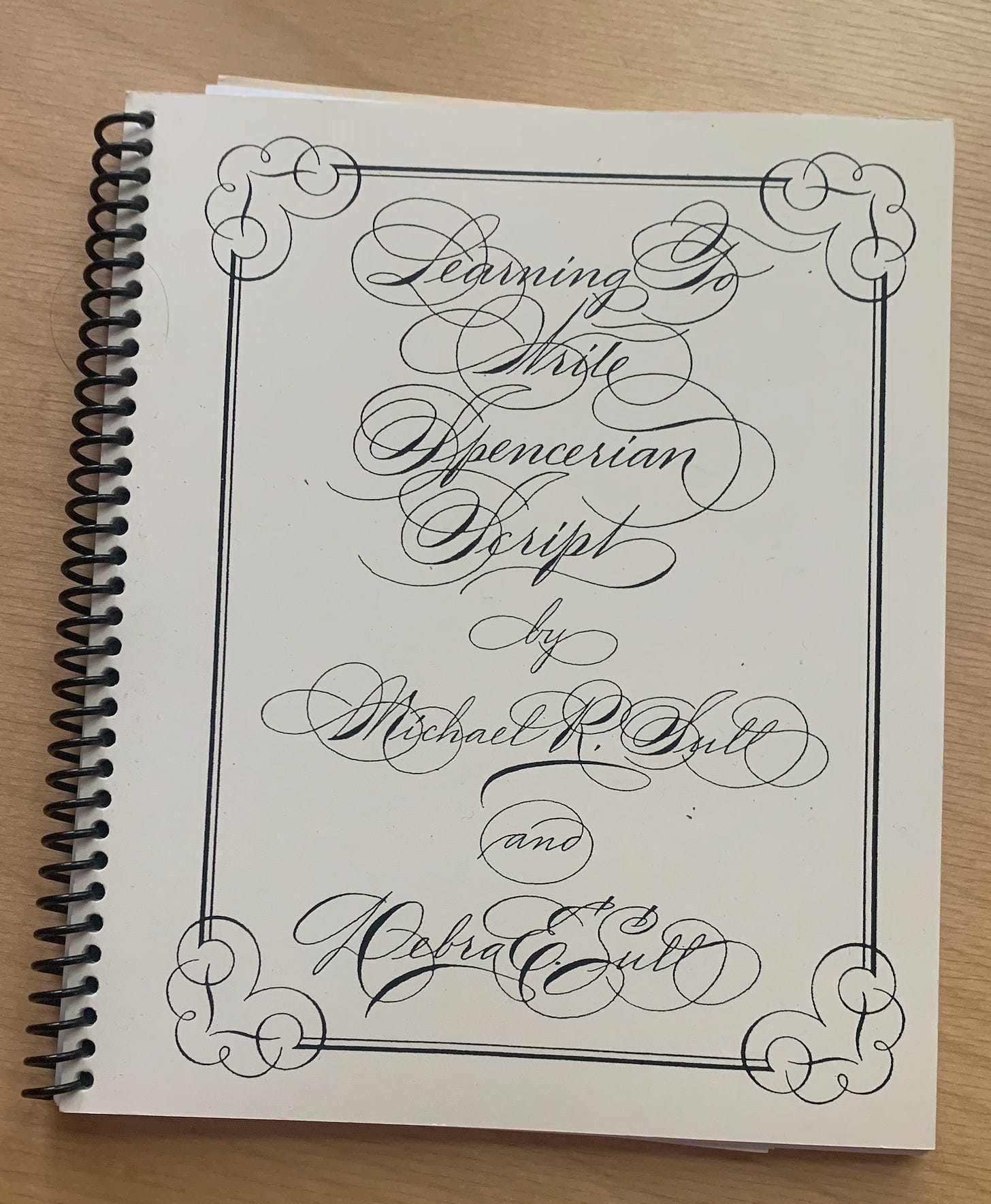
WITH THIS BOOK ON SPENCERIAN SCRIPT.
***IMPORTANT NOTE: if your handwriting is overall terrible, don’t start with cursive. This is too hard; you need to train the basic motor skills before you get on the express train to Swoopyloopshire. Use this book to get your print handwriting legible first.***
This book is written by Michael and Debra Sull. Michael is a master penman, the proprietor of Spencerian.com, and a guy who not only has his own Wikipedia page but has a Wikipedia page with this as the photo:
If I ever do anything notable enough to get my own Wikipedia page, I hope my picture looks half this good. This is a ridiculous amount of swagger. This picture makes him look like he’s shooting a three-episode arc on NCIS where he shows up as Dr. “Ducky” Mallard’s old boarding-school rival who constantly dominates Ducky but then in the second episode Ziva has a heart-to-heart with him while they’re pinned down by sniper fire that helps him understand the value of Ducky’s contributions and then at the end of the last episode he begrudgingly grants Ducky his respect (which is all Ducky ever wanted) and then he occasionally reappears in later episodes as someone Ducky asks for advice while they play chess by Zoom.

Anyway, enough NCIS, even though you have no idea how badly I want to tell you the story about the time in my lawyer days when I had an official meeting with someone from actual NCIS and how hard it was to wait until the end of the meeting to ask them all the questions I had about NCIS.1
The point is: he looks cool and he wrote this book. I bought it from him at a pen show a couple years ago; I think you can also buy it from his website but that is a little less clear to me, and I couldn’t find it on Amazon. I don’t remember how much it cost ($20?) but I have used it so heavily that whatever it cost was worth it.
The type of script this book teaches is called Spencerian, which is kind of like America’s answer to Britain’s Copperplate script. These two scripts look very similar; the key difference is that I tried to learn Copperplate repeatedly and failed but this one worked for me, so Copperplate is dumb and Spencerian is great USA USA USA.
Here is my step-by-step guide on how to successfully learn this yourself.
Step One: Get this book instead of anything on Copperplate.
USA USA USA.
Also the fact that it is spiral-bound means it lays flat which makes using it as a reference guide much easier. Most handwriting books I have are perfect-bound and that’s annoying.
Step Two: Don’t worry about line variation for now.
Ok: you are going to see all of the distinctions in line weights and be like “oh wow that looks good” and then you are going to want to go buy a dip pen and some nibs and some dip-pen ink so you can, like, really commit to this.
DON’T. Just use whatever you are already used to using—a fountain pen, a pencil, the blood of your enemies and a wishbone—and LEARN THE SHAPES FIRST. Even if you are comfortable with a dip pen or a flex-nib fountain pen, you can only learn so much at a time; it’s just way easier to learn all the letterforms first and then add in the additional “shades” later on, once you get the shapes down.
Pretty much every time I tried to learn some fancy script like this I’d get bogged down in line-variation exercises, get bored, and give up—because I wanted to learn how to write LETTERS, not squiggles that are fat on one side and skinny on the other. Instead of learning letterforms I’d just end up with a sore hand and pages of line-variation exercises that made my wife worried for my mental health because they looked like John Doe’s journal entries from Se7en.
And to its great credit, Sull’s Spencerian book tells you to start with a pencil for exactly this reason, which was critical to me actually successfully learning this.
Step Three: Pace yourself.
I learned this in 2022; I think I committed to learning the basic forms over the course of a month or two. I did a couple lowercase letters a day, then went to the uppercase after that, which had much slower progress (more on that in a second). I probably spent somewhere between 30 minutes and 2 hours on it a day depending on how hard that day’s letters were to learn.
You will need to be at a desk for this, and it helps if you have something to listen to while you practice. I did this while listening to several seasons of With Gourley and Rust, a podcast where actors Matt Gourley and Paul Rust ostensibly discuss horror movies but each episode is like two hours and they never actually discuss the movie and instead just discuss their friendship. It’s marketed as a “cozy-cast by two gentle movie lovers” and I think that is a good vibe for learning cursive handwriting.
Or you could go the other direction and listen to grindcore, whatever works for you. BRAT has a new record coming out.
Step Four: Treat yourself with the fun capitals to stay motivated.
This is less a step than a strategy, because the capitals are a beast to learn. That is, you’ll probably sail through the lowercase letters and gain a false sense of confidence that will be utterly decimated once you try to make a capital “B,” so you’ll need some strategy to manage your motivation. Some of the capitals are so tricky that you actually may need to do some of the building-block practicing, like so:
The way to do this is by alternating letters that are stupid and hard with ones that are fun and easy, giving yourself a little reward for toughing it out. This is the same technique I use to trick my blind dog into letting me brush her teeth.
For example, I highly recommend leaving “S” for its own day (it is, without question, the worst) and then using “Q” as a palate cleanser because that one is pretty fun.
Generally, you should plan for 2x the amount of time to learn the capitals as the lowercase. It is worth it, because the elaborate capitals are what make Spencerian look so much fancier than regular school cursive. The book groups the letters into similar forms, which is a helpful way to break down the alphabet into groups—but even then, I found it useful to be a little tactical about which ones I wanted to do based on how enjoyable they were.
Step Five: Learn the shades if you still want to.
Once you can reliably make all the letters, then you can learn the shades (where to put the fat lines) if you want. If you are like me, you’ll probably be like “ehhhhh.” I do it when I want to relax, but it’s not critical for me.
That is, I have a few pretty-good flex-nib pens and a dip pen, and sometimes I’ll break out this book if I want to do some very fancy lettering so I can remind myself of what the shades are supposed to look like. But even then, sometimes I just cheat and kinda color in the parts of the letter that need more ink, as the process of getting all the dip-pen/flex-nib stuff out is a hassle.
Why? Because I don’t want to be a master penman; I just want to be able to write in fancy-enough cursive that normies will be like “oh you have nice handwriting it makes sense and is not weird at all why your pen is so fancy.”
This book did that for me and continues to serve as a reference whenever I do want to get really fancy for some reason. I highly recommend it for learning both fancy and fancy-enough cursive.
that is actually the whole story


I maintain that the way I write capital A is way better. Signed, European.
That duck is horrifying, but it also kinda makes me wish that was the way ducks actually looked. Why don't they? I demand a re-design!